7 Field Service Dashboards To Surface Exceptions And Drive Action
7 Field Service Dashboards To Surface Exceptions And Drive Action
A field service dashboard is a live operational control panel that gives managers a single source of truth and surfaces the few action-oriented KPIs needed to run the day. It pulls work orders, technician locations, invoicing, and SLA status into one screen so owners, dispatchers, and supervisors stop hunting across spreadsheets and apps. The payoff is speed: problems get flagged and fixed while they’re still small.
TL;DR:
- Dashboards should be role-specific, with each view highlighting only relevant, actionable metrics like SLA risks or technician performance.
- Real-time KPIs such as SLA breach alerts and first-time fix rates are critical for immediate action, while trend-based data can be refreshed less frequently.
- Data sources must be integrated via APIs and scheduled syncs, with clear ownership to ensure accuracy and trustworthiness across systems.
- Cloud-based platforms like Firmanager provide centralized, real-time data that streamline operations and help avoid disconnected tools or outdated information.
Table of Contents
- What Types of Field Service Dashboards Should You Track?
- Which KPIs Actually Belong on a Field Service Dashboard?
- How Should You Design Dashboards by Role?
- What Data Feeds a Reliable Service Operations Dashboard?
- How Do Dashboards Turn Data Into Action?
- What’s a Realistic Rollout Checklist for a New Dashboard?
- What Goes Wrong When Teams Adopt Field Service Dashboards?
- Why a Cloud-Synced Platform Changes What a Dashboard Can Do
- How Firmanager Brings Your Dashboard Data Into One Screen
- Sources
What Types of Field Service Dashboards Should You Track?
Not every dashboard belongs on the same screen, and not every role needs the same view. The strongest field service management software separates concerns by function, so each dashboard answers one question well instead of trying to answer everything at once.
- Executive/ops scorecard — revenue, job volume, and margin trends for owners and leadership who need the big picture, not the noise.
- Scheduling and dispatch board — live technician locations, open jobs, and route conflicts for the person assigning work minute to minute.
- Technician performance board — completion rates, callback frequency, and job duration by tech, reviewed by supervisors during coaching sessions.
- SLA and compliance dashboard — contract deadlines, breach counts, and escalation status for operations managers accountable to clients.
- Finance and AR dashboard — invoice aging, unpaid balances, and revenue per technician, the numbers owners check before payroll.
- Inventory and parts availability dashboard — stock levels tied to upcoming jobs, so a tech isn’t dispatched without the part the repair needs.
- Customer satisfaction and ticket dashboard — open complaints, response times, and repeat-visit flags.
That last category matters more than most owners assume. Many customers now expect self-service portals from the companies they hire, and a customer-facing view of job status reduces the “where’s my technician” phone calls that eat dispatcher time.
Which KPIs Actually Belong on a Field Service Dashboard?
Most dashboards fail because they display every number that’s technically available instead of the handful that change behavior. Real-time field service metrics only earn a spot on the screen if someone will act differently after seeing them.
- First-time fix rate — when this drops below your baseline, it usually points to a parts-availability problem or a training gap, not bad luck. Track it by technician, not just company-wide.
- Jobs completed vs. scheduled — the gap reveals utilization problems long before they show up in revenue.
- SLA compliance and breach counts — a single missed SLA on a commercial contract can trigger penalty clauses; a dashboard that flags “at risk” jobs four hours before the deadline gives dispatch time to intervene.
- Revenue per technician and average ticket size — the fastest way to spot underperformance or upsell opportunity.
- AR aging and unpaid invoices — an invoice sitting past 60 days is an urgency signal, not a line item to review at month end.
- Travel and drive time — high drive-time ratios quietly erode capacity even when job counts look healthy.
Pro Tip: Set a hard threshold on SLA-at-risk jobs (say, four hours before breach) and route that single alert to a dedicated channel. One well-tuned alert beats twenty dashboard tiles nobody checks.
Real-time dashboards work best for metrics where the window to act is short, like SLA risk or a stalled job; scheduled refreshes suit trend analysis like monthly revenue per technician, where speed matters less than accuracy.
How Should You Design Dashboards by Role?
The single biggest design mistake in field service analytics tools is building one dashboard and handing it to everyone. An owner doesn’t need job-level detail, and a technician doesn’t need quarterly revenue trends. Role-based views keep each screen relevant.
- Owner/GM: revenue, margin, AR aging, and job volume, reviewed weekly.
- Dispatcher: live technician map, open jobs, and route conflicts, refreshed continuously.
- Field supervisor: technician performance, callback rates, and SLA-at-risk jobs by crew.
- Technician: their own schedule, job notes, and parts status, on a phone screen.
Action-oriented widgets should surface exceptions, not just totals. A tile that reads “3 jobs breaching SLA today” with a one-click link to the filtered job list drives behavior; a static pie chart doesn’t. Use color coding sparingly, reserve red for genuine exceptions, and keep executive scorecards physically separate from task-level boards so a manager scanning revenue isn’t also wading through individual work orders.
Pro Tip: If a widget doesn’t change what someone does next, cut it. Vanity metrics clutter the screen and slow down the widgets that matter.
Mobile access isn’t optional anymore. Technicians in the field need a responsive view that works on a spotty signal, with offline caching for job details when connectivity drops.
What Data Feeds a Reliable Service Operations Dashboard?
A dashboard is only as trustworthy as the data behind it, and most reliability problems trace back to disconnected sources rather than bad design. The core feeds are work orders, GPS tracking, timecards, CRM records, invoicing, and inventory counts.
- Real-time streaming fits fast-moving data like technician location and SLA countdowns.
- Scheduled syncs work fine for financial summaries and month-over-month trend reporting.
- Integration methods typically include APIs, webhooks, and change-data-capture feeds that push updates the moment a record changes.
- Data ownership needs a clear owner per source, so nobody is guessing whose job it is to fix a broken feed.
- Role-based access controls limit who sees financial data versus job-level detail.
Platforms built for real-time operational dashboards rely on template widgets and drag-and-drop layouts precisely because rebuilding views from scratch for every team wastes the time dashboards are supposed to save. Role-scoped access with a mix of live-stream and cached refresh keeps leadership and field staff looking at the same underlying data without overwhelming either group.
How Do Dashboards Turn Data Into Action?
A number on a screen changes nothing by itself. The dashboards that actually improve operations connect insight to action through alerts, drilldowns, and automation.
- Alert triggers create a task automatically — an SLA-at-risk flag doesn’t just glow red, it generates a task assigned to the right dispatcher.
- Drilldowns move from KPI to job list to action — clicking “12 unpaid invoices” filters straight to those accounts, ready for follow-up.
- Automated escalation reroutes missed SLAs — if a job isn’t accepted within a set window, it escalates to a supervisor without anyone needing to notice manually.
- Daily standups run off the same screen — dispatchers and supervisors review the identical exception list every morning instead of comparing separate reports.
Pro Tip: Build one dashboard view specifically for shift handoffs. A tech going off shift should be able to hand a live job list to the incoming crew in under a minute.
What’s a Realistic Rollout Checklist for a New Dashboard?
Rolling out a dashboard company-wide on day one is how most implementations stall. A phased pilot works better.
- Set goals and pick a small pilot KPI set — three to five metrics, not fifteen.
- Map data sources and assign an owner per feed, so gaps get fixed quickly.
- Build role views and test with real users from dispatch and the field, not just management.
- Train users and document the drilldown paths so nobody has to relearn navigation weekly.
- Measure adoption before scaling — if dispatchers aren’t opening the dashboard daily, fix the design before adding more teams.
What Goes Wrong When Teams Adopt Field Service Dashboards?
The most common failure isn’t technical, it’s behavioral: teams build a dashboard, celebrate the launch, and then watch usage drop off within weeks. A few patterns explain most of that decline.
Metric overload kills adoption faster than anything else. When a screen shows thirty tiles, users stop scanning it altogether and revert to phone calls and gut instinct. The fix is ruthless curation, not better visualization.
Mixing executive and task-level detail on one screen is a related trap. A dashboard trying to serve an owner’s quarterly review and a dispatcher’s minute-by-minute needs ends up serving neither well, and separating those views usually solves half the complaints about “the dashboard being useless.”
Stale or conflicting data erodes trust quickly. If a technician’s app shows a job as open while the dashboard shows it closed, users stop trusting either system, and rebuilding that trust takes far longer than the sync issue itself did.
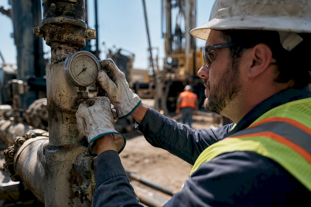
Ignoring mobile reality is another recurring problem. A dashboard designed only for a desktop browser is invisible to technicians who spend their day in a truck or on a roof, which quietly cuts the field team out of the loop the dashboard was supposed to include.
Skipping the pilot phase and rolling out to every team simultaneously means design flaws surface at full scale instead of with a small, forgiving test group. A short pilot with five to ten users catches most of these problems before they become company-wide complaints.
Why a Cloud-Synced Platform Changes What a Dashboard Can Do
Most dashboard failures trace back to disconnected systems, not bad chart design. When work orders live in one tool, invoicing in another, and technician schedules in a spreadsheet, reconciling them into one accurate view becomes a part-time job for someone.
A modular, cloud-synced platform sidesteps that entirely because the dashboard isn’t pulling from five disconnected sources, it’s reading from one. That’s the practical case for the checklist above: fewer integration points, fewer ownership gaps, and financial KPIs like AR aging that reflect invoices the moment they’re generated rather than after a nightly batch job. When work order data and invoicing share the same system, tying logged hours to billed hours becomes a same-day comparison instead of a monthly audit. That single change closes one of the more expensive gaps we see in field service operations: the slow drift between hours worked and hours billed.
— KaiosMedia
How Firmanager Brings Your Dashboard Data Into One Screen
Firmanager is built around the same problem this article just walked through: field service teams drowning in disconnected tools while the dashboard they actually need sits scattered across five logins. Firmanager solves that by keeping CRM, work orders, invoicing, and HR data cloud-synced under a single platform, so your dashboard reflects reality the moment a job status changes or an invoice gets paid.
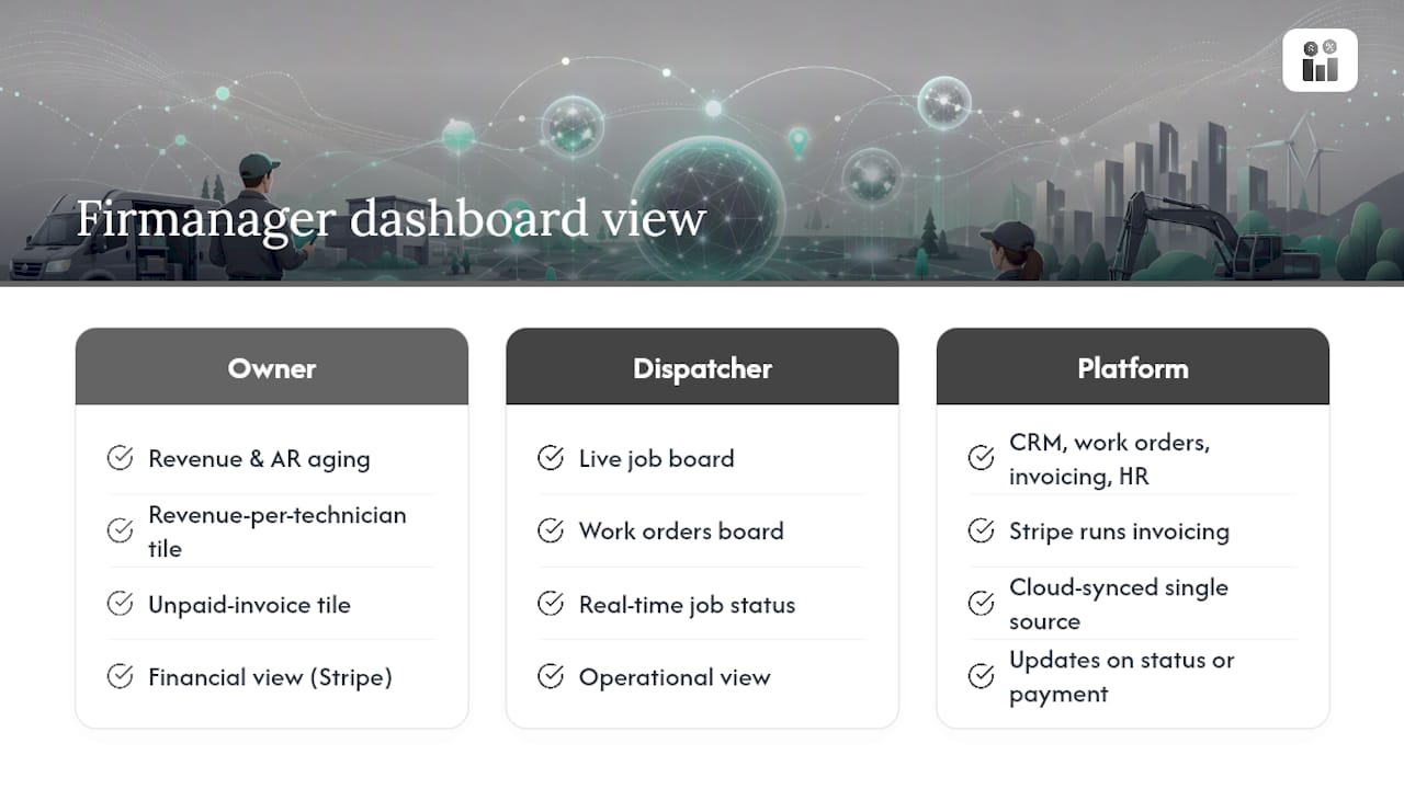
Role-based access means an owner sees revenue and AR aging while a dispatcher sees the live job board, without either group wading through the other’s clutter. Because invoicing runs through Stripe inside the same system as work orders, revenue-per-technician and unpaid-invoice tiles update from the same source data your field teams are already using, closing the gap between operations and cash flow that separate tools create.
If you’re ready to see what a single source of truth looks like for your own operation, start with Firmanager’s platform and run a small pilot with one crew before rolling it out company-wide.
Sources
For deeper detail on scheduling views and technician-facing apps referenced above, see this guide to service scheduling software and this breakdown of mobile job management for field teams. For SLA thresholds and escalation examples, SLA tracking for service managers covers the practical mechanics in more depth.
- Real-time Interactive Dashboards | Datadog
- Real-Time Dashboard Software for Live KPI Monitoring | Fusedash
- Share of customers by if they expect brands to have a self-service portal | Statista
Recommended
Run your whole business in one place
CRM, quotes, work orders, invoicing, expenses, HR and HSE — one login, every device. Free-forever plan.
Start free →