4–6 Weekly KPIs That Prevent Bad Surprises in Service Businesses
4–6 Weekly KPIs That Prevent Bad Surprises in Service Businesses
Track four to six KPIs weekly. One per category, revenue, retention, operations, and customer health, plus a single leverage metric tied to your biggest current risk. Review operational numbers weekly, revenue and retention monthly, and strategic KPIs quarterly. That rhythm, not the size of your dashboard, is what turns service business KPIs into decisions instead of decoration.
TL;DR:
- Tracking four to six KPIs weekly, one per category plus a leverage metric, ensures focused decision-making rather than dashboard clutter.
- Prioritize KPIs based on company stage, with cash flow and job completion for startups, scaling metrics for growth, and profitability and reputation for mature businesses.
- Use automated data sources and assign clear ownership to each KPI to avoid noise and ensure timely, actionable insights.
- Meeting cadence should include weekly operational reviews, monthly business assessments, and quarterly strategic reevaluations for sustained growth.
- Avoid common pitfalls by limiting metrics to those with defined thresholds, consistent definitions, and taking action based on trends, not daily fluctuations.
Table of Contents
- What Are Service Business KPIs and Why Four Categories Matter
- How Many KPIs Should You Actually Track?
- The Service Business KPI Bank: Formulas and Benchmarks
- Turning Your Dashboard Into a Habit: Owners, Cadence, and Triggers
- Common KPI Mistakes That Turn a Dashboard Into Noise
- How Firmanager Turns These KPIs Into Automatic Numbers
- A Manager’s 10-Minute Monday KPI Ritual
- See Your KPIs on One Screen With Firmanager
- Where to Go Deeper on Benchmarks and Formulas
- Sources
What Are Service Business KPIs and Why Four Categories Matter
Service business KPIs are the measurable indicators that tell you whether your operation is making money, keeping customers, running efficiently, and delivering work people actually want again. Field service metrics like utilization or first-time fix rate answer a different question than revenue metrics like average ticket size, so a dashboard built from only one category leaves you blind to entire failure modes.
Group your service performance metrics into four buckets:
- Revenue: Is the business generating enough money per job and per customer? Track monthly recurring revenue (MRR), average ticket, and gross margin per job.
- Retention: Are customers staying and coming back? Track churn rate, repeat booking ratio, and customer lifetime value (LTV).
- Operational/process: Is work getting done efficiently and correctly? Track utilization rate, first-time fix rate, and no-show rate.
- Customer health: Are the people you serve actually satisfied? Track Net Promoter Score (NPS), CSAT, and Customer Effort Score (CES).
You need at least one KPI from each category because a business can look healthy on paper (strong MRR) while quietly rotting somewhere else (a rising churn rate). Rhythm Systems recommends organizing KPIs into four categories precisely because each answers a question the others cannot.
How Many KPIs Should You Actually Track?
Track 8 to 12 KPIs at the company level, and shrink that to a 4 to 6 KPI weekly action dashboard, according to Rhythm Systems’ KPI framework for service companies. Anything beyond that range tends to dilute attention rather than sharpen it.
Prioritize with one simple rule: one KPI per category, plus one or two leverage metrics tied to whatever is currently your biggest operational risk. If no-shows are eating your schedule, no-show rate earns a permanent weekly slot. If margins are thinning, gross margin per job does.
Your KPI bundle should also shift with company stage:
- Startup: Cash flow, average ticket, and job completion rate. Survival metrics first.
- Growth: Utilization rate, CAC, and repeat booking ratio. You’re testing whether the model scales.
- Scale: LTV, gross margin per job, and NPS. You’re protecting profitability and reputation at volume.
The Service Business KPI Bank: Formulas and Benchmarks
Here is the working reference most operations managers actually need, organized by category with the exact formula and a realistic target range.
Revenue KPIs
- MRR (Monthly Recurring Revenue): Sum of all recurring contract or subscription revenue per month. Rising MRR with flat headcount signals healthy operating leverage.
- Average ticket: Total revenue divided by number of jobs. Benchmarks vary sharply by trade, so 2026 field-service data recommends treating this as a starting point specific to your service line, not a universal number.
- Revenue per technician per day: Total revenue divided by (active techs × workdays). This exposes whether growth is coming from more staff or more output per person.
- Gross margin per job: (Job revenue minus direct job costs) divided by job revenue. A slipping margin here, even with rising revenue, usually means pricing or labor costs have drifted.
- Customer Acquisition Cost (CAC): Total sales and marketing spend divided by new customers acquired. Pair this with LTV, never read alone.
Retention KPIs
- Customer Lifetime Value (LTV): Average revenue per customer multiplied by average customer lifespan. LTV should exceed CAC by a healthy multiple, ideally three times or more, before you scale acquisition spend.
- Churn rate: Customers lost in a period divided by customers at the start of that period. Rising churn alongside stable NPS usually points to a pricing or competitive problem, not a service problem.
- Repeat booking ratio: Repeat customers divided by total customers in a period. This is often a better early-warning signal than churn because it moves faster.
Operational KPIs
- Utilization rate: Billable hours divided by total available hours. Field service benchmarks put strong performance in the 75% to 90% range. This should flex by trade and crew size.
- First-time fix rate: Jobs resolved on the first visit divided by total jobs. Top performers land between 75% and 86%, and this metric should always be read alongside mean time to repair, since a technician chasing a high fix rate can quietly let repair times creep up.
- No-show rate: Missed appointments divided by total scheduled appointments. Weekly benchmark data treats this as one of the highest-leverage operational KPIs because it directly erodes technician utilization.
- Work-in-progress (WIP) count: Open jobs not yet invoiced. A creeping WIP count is often the earliest sign of a billing or dispatch bottleneck, well before revenue numbers show any strain.
Customer KPIs
- NPS: Percentage of promoters minus percentage of detractors, collected via a simple “how likely are you to recommend us” survey. HubSpot’s guidance pairs NPS with operational metrics like first response time to avoid chasing a score in isolation.
- CSAT: Percentage of customers rating a specific interaction positively, collected immediately after job completion. Response rates matter more than most managers assume, so automating the request through a customer portal tends to lift completion significantly.
- CES (Customer Effort Score): Customer-rated ease of getting their issue resolved. A low CES paired with high CSAT often reveals a process that works but frustrates people getting there.
Turning Your Dashboard Into a Habit: Owners, Cadence, and Triggers
A KPI without an owner is a statistic nobody acts on. Assign exactly one person to each metric and define Red, Yellow, and Green thresholds before the first review, not after a number looks alarming.
Build your cadence around three fixed meetings:
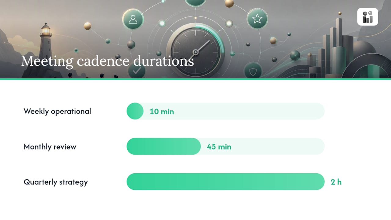
- Weekly operational check (10 minutes): Review the 4 to 6 KPI dashboard, flag anything Red, and assign one corrective action with a deadline.
- Monthly business review (45 minutes): Walk through revenue and retention trends, compare against the prior month, and adjust targets if the market has shifted.
- Quarterly strategic review (2 hours): Reassess which KPIs still matter, retire ones tied to solved problems, and reset stretch targets for the next quarter.
NoShowCalc’s cadence research backs this exact split: weekly for operational metrics, monthly for revenue and retention, quarterly for anything strategic. Daily monitoring, by contrast, mostly just generates noise you’ll end up ignoring.
Design your dashboard around three layers: a top-level health view, a “what changed this week” delta view, and a drill-down for root cause when something flips Red. A well-built field service dashboard surfaces exceptions automatically instead of forcing someone to hunt for them.
Set realistic targets based on your own trailing 90 days, then layer a stretch target on top rather than replacing the baseline. Overreacting to a single bad week is the fastest way to burn out a team on metrics they’ll eventually stop trusting.
Pro Tip: Before reacting to any single red metric, check whether it moved because of a real operational shift or because of a small sample size, one bad week from a five-person crew can swing utilization 15 points without meaning anything.
Common KPI Mistakes That Turn a Dashboard Into Noise
Most service businesses fail their own KPI program before it fails them. The usual culprits:
- Tracking too many metrics. Twenty KPIs on a dashboard means nobody owns any of them.
- No assigned owner. A metric owned by “the team” is owned by no one.
- Inconsistent definitions. If sales counts a “close” differently than finance counts a “booked job,” your numbers will never reconcile.
- Reacting to daily noise. A one-day utilization dip is not a trend; a five-day trend is.
The real fix is pairing it with mean time to repair data, which shows techs slowed down to fix jobs properly rather than rushing back out. The paired view tells the true story; the single metric almost caused a bad decision.
How Firmanager Turns These KPIs Into Automatic Numbers
Most of the friction in KPI tracking isn’t deciding which metrics matter, it’s getting clean numbers without someone manually pulling data from four different tools every week.
Cloud-synced modules solve that by feeding KPI math automatically instead of requiring a spreadsheet rebuild every Monday:
- Time capture flows into utilization rate the moment a technician clocks a job, no manual timesheet reconciliation.
- Invoicing data flows into revenue KPIs like average ticket and gross margin per job as soon as invoices sync through Stripe.
- SLA tracking triggers alerts when a job risks missing its window, feeding your on-time delivery rate before it becomes a customer complaint.
Start small: connect two or three data sources, build one dashboard page, assign owners to each number, and run a single weekly check before adding more. That’s the whole playbook.
A Manager’s 10-Minute Monday KPI Ritual
Every Monday at 9:00 AM, the operations manager, the dispatcher, and the lead technician pull up four numbers: utilization rate, no-show rate, average ticket, and NPS from last week’s completed jobs. Each gets thirty seconds. No debate, no deep dives.
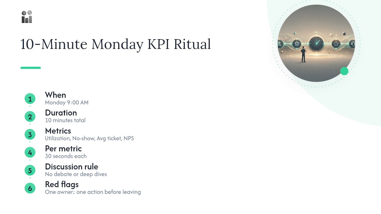
Last month, no-show rate flagged Red at 18%, well above the team’s 10% threshold. The dispatcher traced it to a batch of appointments booked without a confirmation text.
Paste this into your calendar: Monday, 10 minutes, 4 numbers, one owner per Red flag, one action item before you leave the room.
— KaiosMedia
See Your KPIs on One Screen With Firmanager
A connected platform replaces the spreadsheet-and-multiple-apps routine with a single login where CRM, work orders, invoicing, and SLA tracking feed the same dashboard automatically. That means your utilization rate, average ticket, and on-time delivery rate update themselves instead of waiting for someone to pull reports on a Friday afternoon.
If you’ve been assembling service performance metrics by hand across disconnected tools, that manual pull is usually the real bottleneck, not a lack of KPI knowledge. A modular design means you can connect CRM data, work orders, and invoicing first, then layer in HR and compliance tracking as your dashboard needs grow. Visit the Firmanager platform to see how a connected dashboard looks with your own KPI categories mapped in, and start a trial to build your first weekly review this week.
Where to Go Deeper on Benchmarks and Formulas
For further reading on service business KPIs, consult Rhythm Systems’ KPI framework, NoShowCalc’s cadence guidance, Fixyflow’s 2026 field service benchmarks, HubSpot’s customer service KPI catalog, and VSight’s field service formulas. For marketing-adjacent KPIs, Todd Stager’s SEO tracking guide is a useful companion resource.
Sources
- 40 KPI Examples for the Service Industry in 2026
- Service Business KPIs That Actually Matter | NoShowCalc
- 15 Service Business KPIs to Track Weekly (2026 Benchmarks)
- 20 Customer Service KPIs You Need To Know
- Field Service KPIs: Formulas & Benchmarks | VSight
Recommended
Run your whole business in one place
CRM, quotes, work orders, invoicing, expenses, HR and HSE — one login, every device. Free-forever plan.
Start free →